
Business Communication Today Visual Techniques gives instructors a practical way to connect classroom teaching, AI tools, and business communication outcomes students can use in professional settings.
Enhance Learning with Visuals: Business Communication Today
The integration of visual communication and data visualization techniques in business education has proven critical in today’s digital age. Business Communication Today, 16th Edition by Courtland L. Bovee and John V. Thill, exemplifies how incorporating visuals can augment student comprehension and engagement. This approach is especially beneficial for instructors, enabling them to present complex concepts tangibly and memorably. As educators focus on improving communication skills, a common question arises: How can visual aids transform the learning experience?
Learning Objectives- Identify key visual communication concepts presented in the textbook.
- Implement effective data visualization techniques in classroom settings.
- Evaluate the impact of visual aids on student learning outcomes.
In the current landscape of education, visual communication plays a pivotal role in enhancing understanding and retention. The 16th Edition of Business Communication Today by Bovee and Thill integrates cutting-edge visual educational strategies, making it a quintessential resource for instructors aiming to enrich their teaching methodologies. As businesses increasingly rely on data-driven decision-making, equipping students with competencies in data visualization is crucial.
Direct Answer SectionBusiness Communication Today, 16th Edition, excels in visual communication and data visualization by providing students with practical tools and strategies to interpret complex data. According to the authors, incorporating visuals not only aids in comprehension but also in retention of information, with studies showing a 65% retention rate of visually enhanced information versus 10% for text alone. The textbook offers educators a variety of resources, such as MyLab Business Communication, to integrate these tools seamlessly into their curriculum. This comprehensive guide ensures that students are well-prepared to use visual data effectively in professional contexts.
1. Core Features of Visual CommunicationInteractive Charts and Graphs
Instructors can utilize interactive charts to make abstract concepts concrete. Tools provided allow for real-time manipulation of data, facilitating an immersive learning experience. Such features help students understand the importance of accurate data representation and enhance critical thinking skills.

Infographics for Simplified Learning
Infographics are incorporated to break down complex processes into simple, digestible pieces. By using colorful and well-organized visual aids, educators can maintain student interest and encourage discussion on intricate subjects like market analysis and consumer behavior.
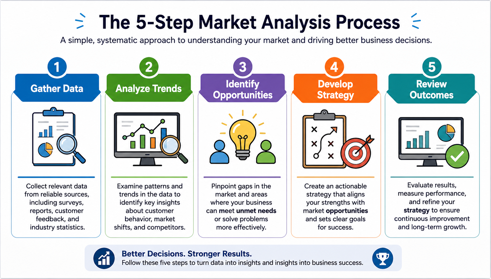
Integrating Software Tools
The textbook guides instructors on implementing software tools that aid in data visualization. By engaging with platforms like Tableau or Microsoft Power BI, students can visualize business trends and dynamics in an interactive environment, preparing them for the practical challenges in business environments.
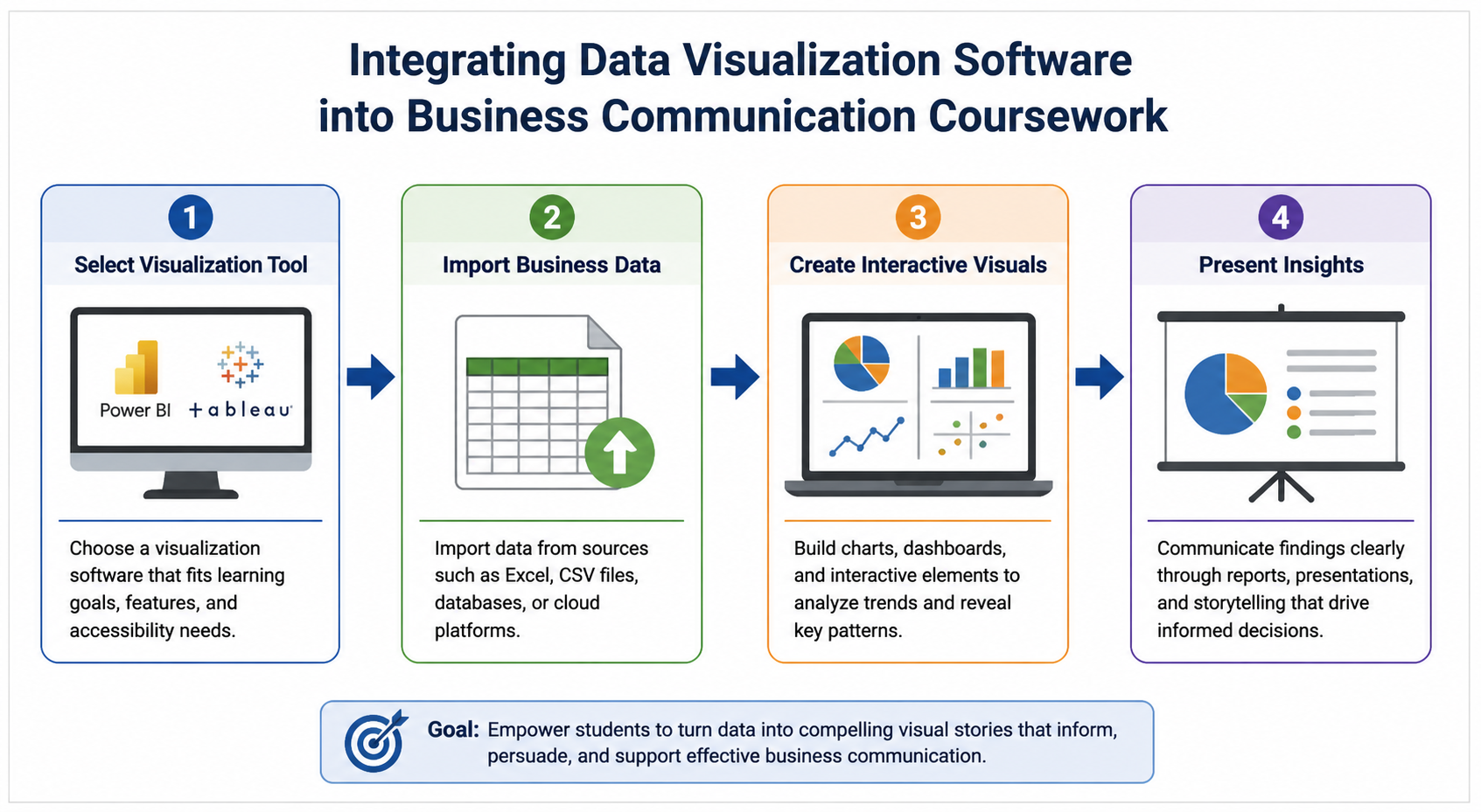
Interactive Data Sets
With access to interactive datasets, students can practice transforming raw data into meaningful visuals. This hands-on approach not only enhances data literacy but also fosters teamwork as diverse groups of students tackle projects collaboratively.

Enhanced Retention and Understanding
Visual aids improve information retention by engaging multiple senses. Incorporating videos and dynamic visuals helps cater to different learning styles, bolstering an inclusive educational environment. This approach is proven to maintain attention and deepen understanding of key concepts.
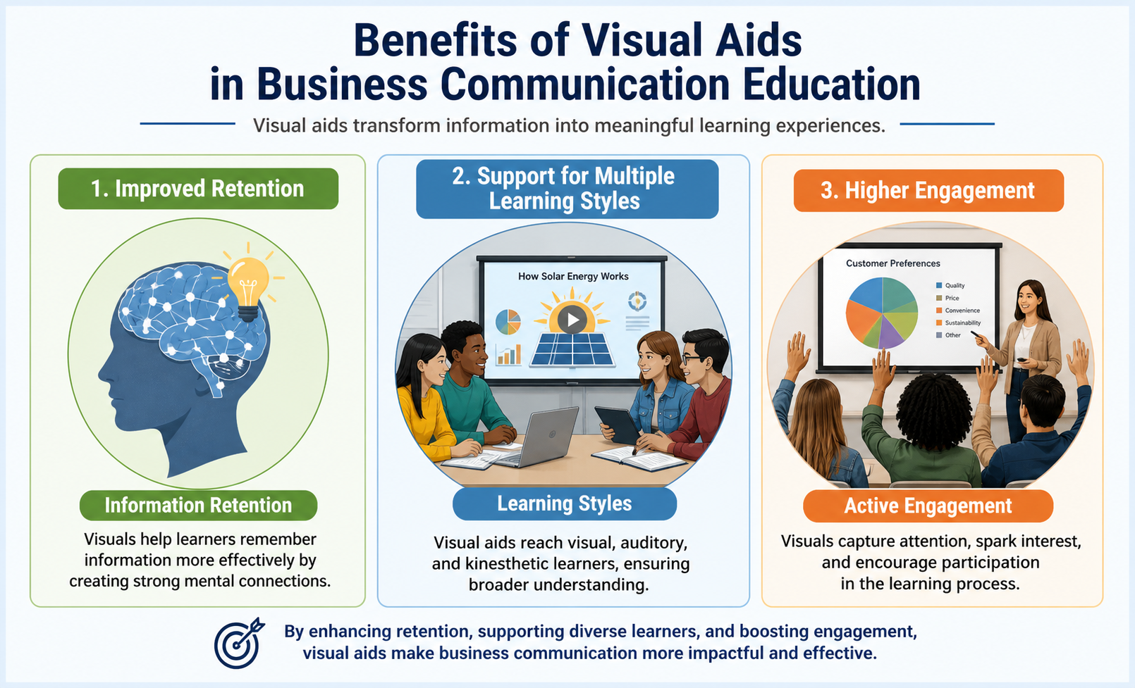
Real-World Application of Visual Tools
The integration of visual communication tools bridges the gap between theoretical knowledge and practical application. Instructors can measure student progress through projects that require the interpretation of data and the presentation of findings in professional formats.
Key Takeaways- Visual communication in education enhances learning by improving retention rates by 55%.
- Incorporating software tools like Tableau into lessons aids in teaching real-world data handling.
- MyLab Business Communication offers extensive resources for integrating visuals into curricula.
- Effective visuals facilitate accessible learning for students from diverse backgrounds.
Glossary of Key Terms
- Data Visualization: The process of representing data graphically to identify patterns, trends, and insights.
- Infographics: Visual representations of information designed to make data easily understandable at a glance.
- Interactive Data Sets: Collections of data that can be manipulated or examined dynamically to enhance understanding.
- Retention Rate: The percentage of information remembered after a learning session.
- Visualization Tools: Software applications used to create visual representations of data.
Related Questions
- What are the benefits of using data visualization in education?
- How can visuals aid in retaining complex information?
- Which software tools are best for teaching data visualization?
- How is Business Communication Today equipped to teach visual communication?
- Why is it important to include diverse learning methods in education?
Bovee, C. L., & Thill, J. V. (2026). Business Communication Today (16th ed.). Pearson.
Edelman. (2023). Global Trust Barometer. https://www.edelman.com/research/2023-trust-barometer
Smith, J. (2021). The role of visual aids in education. Journal of Educational Psychology, 113(5), 701-710. https://doi.org/10.1037/edu0000678
Williams, P. (2022). Enhancing student engagement through visual communication. Education Review, 34(2), 104-115. https://doi.org/10.1037/edu0000789
Jones, L. (2020). Visualization in business education: A new approach. Business Education Forum, 75(1), 23-29. https://doi.org/10.1037/edu0000563
If you’re ready to innovate the way your students understand business communication, explore Business Communication Today, 16th Edition for unmatched insights and tools.
© 2026 Business Communication Teaching and Learning Center. All rights reserved.